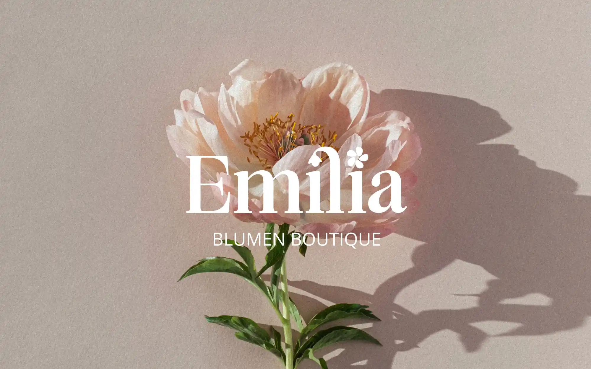
Emilia
Emilia is an example of a flower shop that curates and delivers flowers and decorations for special occasions. The goal is to create a visual identity that is elegant and harmonious, evoking emotions of trust (in the quality of the products) and well-being (when entering the store) among the target audience.
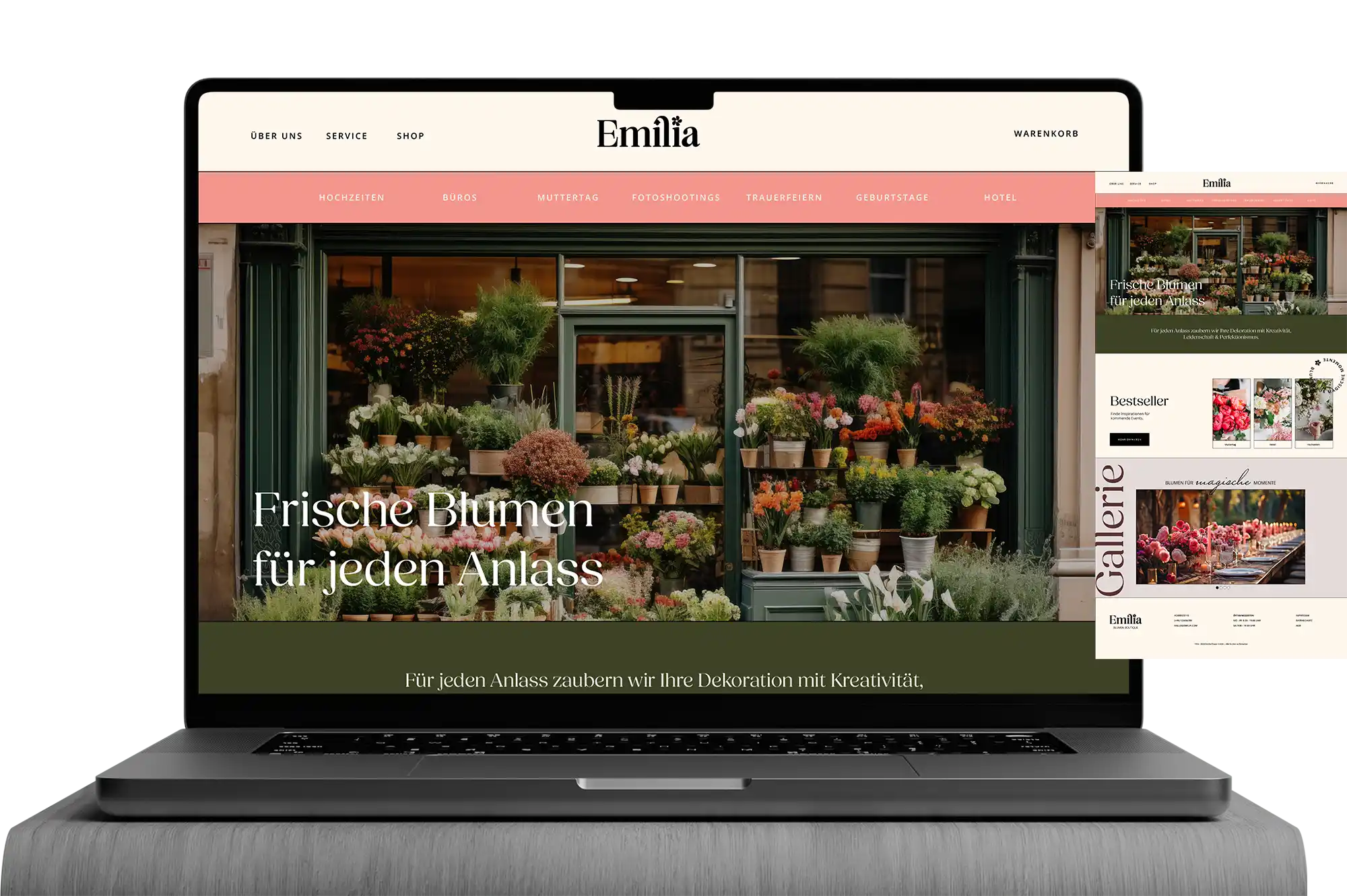
Branding | Print | website
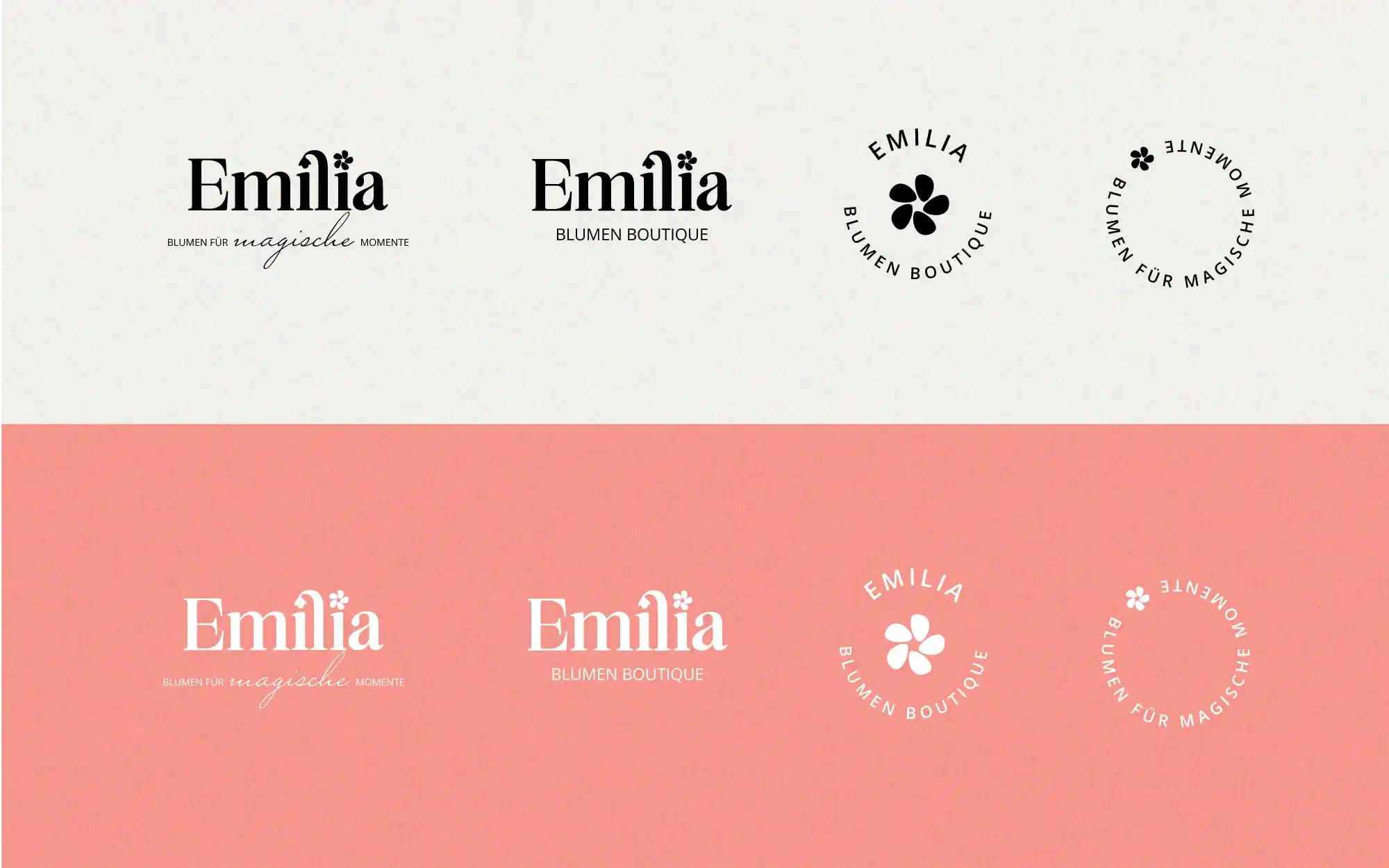
The main logo has additional variations (submarks). This guarantees that the logo remains recognizable in all formats, especially in square profile pictures on social media platforms, without being cut off or displayed too small.
The dot on the ‘i’ is a flower, which can be used as a visual mark, icon, and pattern.

Dark green: stability, nature, base, trust
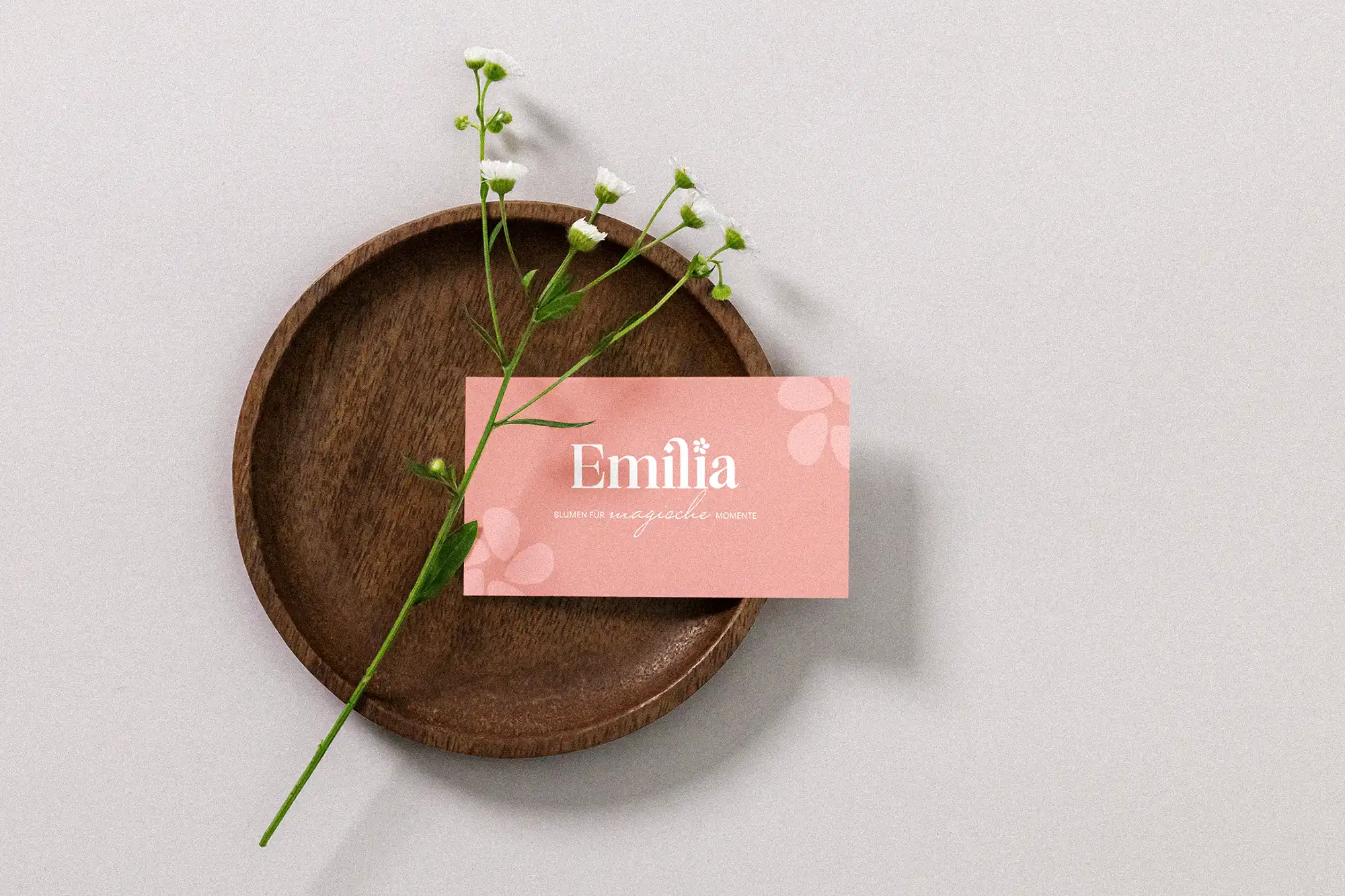
Rosé: elegance, feminine, warmth
Did you like the concept? And would you like something similar for yourself?